


The major averages did not fully show what was changing beneath the surface Monday.
Across the four U.S. equity universes monitored by Zerblix, 113 fresh downside Point & Figure signals appeared against 33 fresh upside signals. More important than the total was where the weakness developed: Technology and Industrials accounted for most of the new supply, with semiconductors forming the largest identifiable industry cluster.
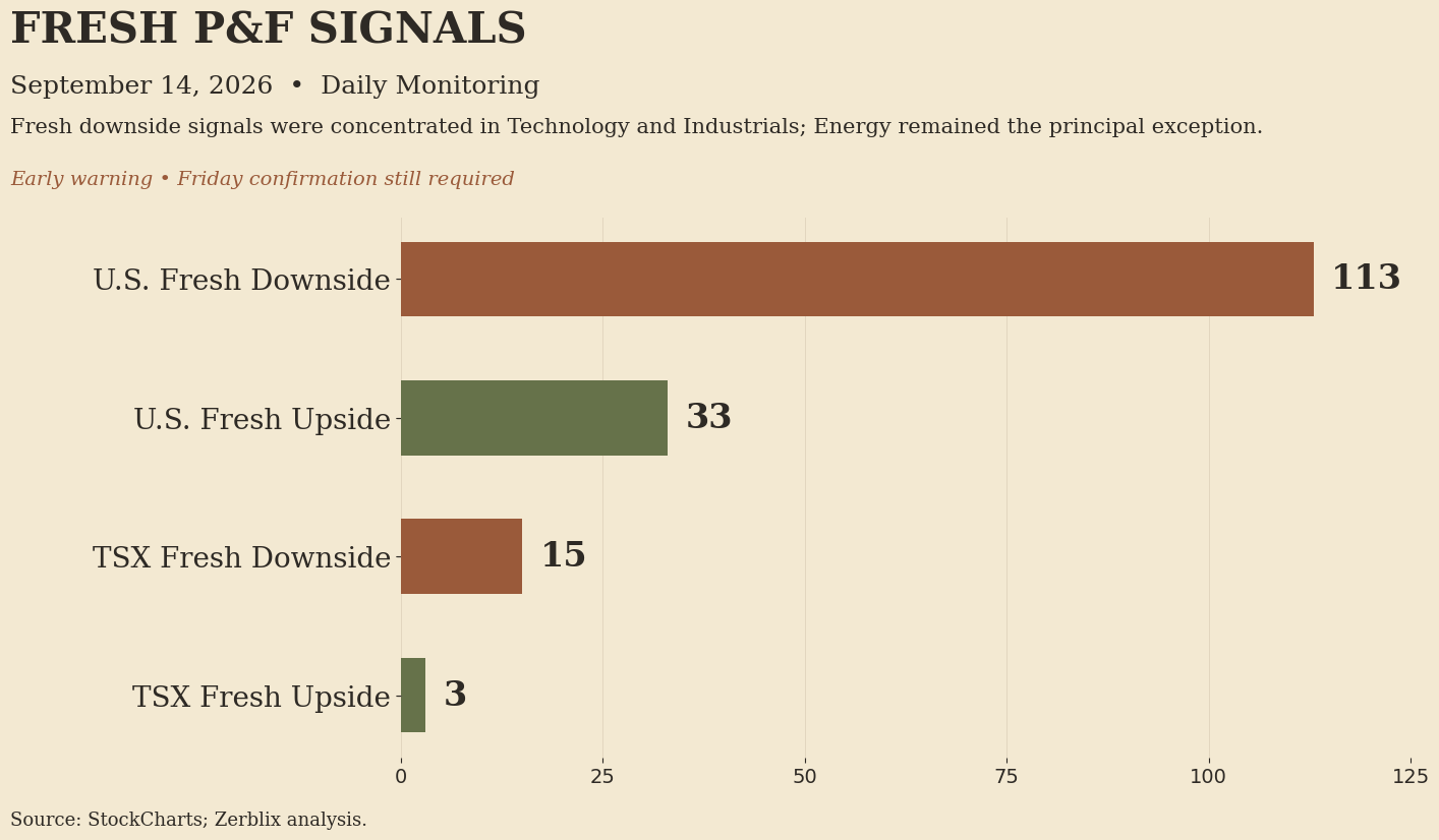
Supply concentrated in Technology and Industrials
Technology produced 44 fresh downside signals and Industrials another 36. Within Technology, 25 semiconductor-related securities appeared in the downside group.
A downside P&F signal develops when price moves below a previous low. In supply-and-demand terms, sellers have become strong enough to penetrate an area where demand had previously stopped the decline.
Breadth supported that reading. The Nasdaq 100 Bullish Percentage fell from 42.57% to 37.62%. Technology stood at 42.25%, while Industrials declined to 24.05%.
The fresh signals and the breadth readings therefore pointed in the same direction: favorable structure was becoming less broadly distributed in two important areas of the market.Energy remained the important exception.
Energy did not participate in the deterioration.
Energy Bullish Percentage held at 90.48%, and broad ETF leadership remained concentrated in oil- and energy-related exposure. In Canada, Imperial Oil also produced a fresh upside P&F signal.
Canada showed the opposite condition in precious-metals shares. The TSX recorded 15 fresh downside signals against 3 upside signals, but 13 of the downside signals came from Materials and 10 were precious-metals companies.
Silver also produced the only fresh downside signal in the Zerblix 24-ETF macro group.
The evidence therefore showed separation rather than uniform weakness: oil and Energy retained demand while Technology, Industrials and precious-metals equities experienced increasing supply.
TLT: Persistent supply across several horizons
The clearest ETF example was the iShares 20+ Year Treasury Bond ETF (TLT).
TLT appeared in screens identifying 52-week major weakness, 3-month emerging weakness and broad ETF confirmed weakness. These are not three separate bearish events. They indicate that the same weak condition is visible across several horizons.
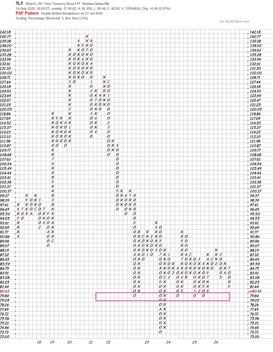
81.44 — Current O-column low
A column of O’s represents declining prices. At the present stage of the chart, supply remains in control.
The importance of 81.44 is not that it is a forecast level. It identifies the lowest completed box in the present column and provides the starting point from which both further downside progress and a possible reversal can be judged.
80.63 — Next downside box
With 1% percentage boxes, 80.63 is the next lower box.
A print at that level would extend the current column of O’s and show additional downside follow-through. Supply would still be sufficiently strong to carry price another box lower.
The next area, however, is more important than an ordinary additional O.
79.84–79.05 — Prior demand area
A cluster of prior P&F lows is visible in the 79–80 area. Several previous declines stopped in or near this region before demand was able to produce a reversal.
That makes the area important from a supply-and-demand standpoint.
79.84 represents the first test of that prior demand shelf. If the decline stops and a reversal develops from this area, the chart would again demonstrate that buyers are willing to absorb supply near previous lows.
A move through approximately 79.05 would be more significant. Price would be penetrating an area where demand had repeatedly appeared before.
Such a move would not simply represent one more lower box. It would indicate that supply had become strong enough to overcome a recurring area of support.
That is the more important bearish test on the present chart.
83.91 — Three-box reversal
Improvement requires the opposite process.
Under the three-box reversal method, TLT must rise three boxes before the chart can change from O’s to X’s.
From 81.44, those boxes are approximately:
82.25 → 83.08 → 83.91
At 83.91, the chart could reverse from O’s into X’s. That requires roughly a 3% recovery from the current O-column low and would be the first evidence that demand had become strong enough to interrupt the decline.
A reversal, however, would not complete the repair.
85.59 — Recent X-column high
An advance above the recent X-column high near 85.59 would have greater structural significance. Demand would not merely have reversed the current column; it would begin to overcome the high established during the preceding rally.
In P&F terms, that would provide stronger evidence that the short-term structure was improving.
The chart also records a Double Bottom Breakdown on July 27, so the current O-column is developing within an already weakened background rather than as an isolated one-day decline.
What Monday established
Monday’s evidence did not indicate indiscriminate weakness.
It showed increasing separation beneath the indexes: concentrated supply in Technology and Industrials, pronounced semiconductor weakness, pressure in Canadian precious-metals shares and persistent weakness in long-duration Treasuries.
Energy and oil remained the principal exception.
The early-warning interpretation would weaken if Technology and Industrial breadth recover, fresh downside signals contract, or TLT holds the 79–80 demand area and begins to reverse.
It would strengthen if the weak groups continue to deteriorate and TLT penetrates that support shelf while Energy continues to retain stronger participation.
For now, this remains Daily Monitoring evidence. Friday will determine whether the separation persists, strengthens, repairs or fails.